

Why Every Healthcare Communicator Needs Data Storytelling Skills
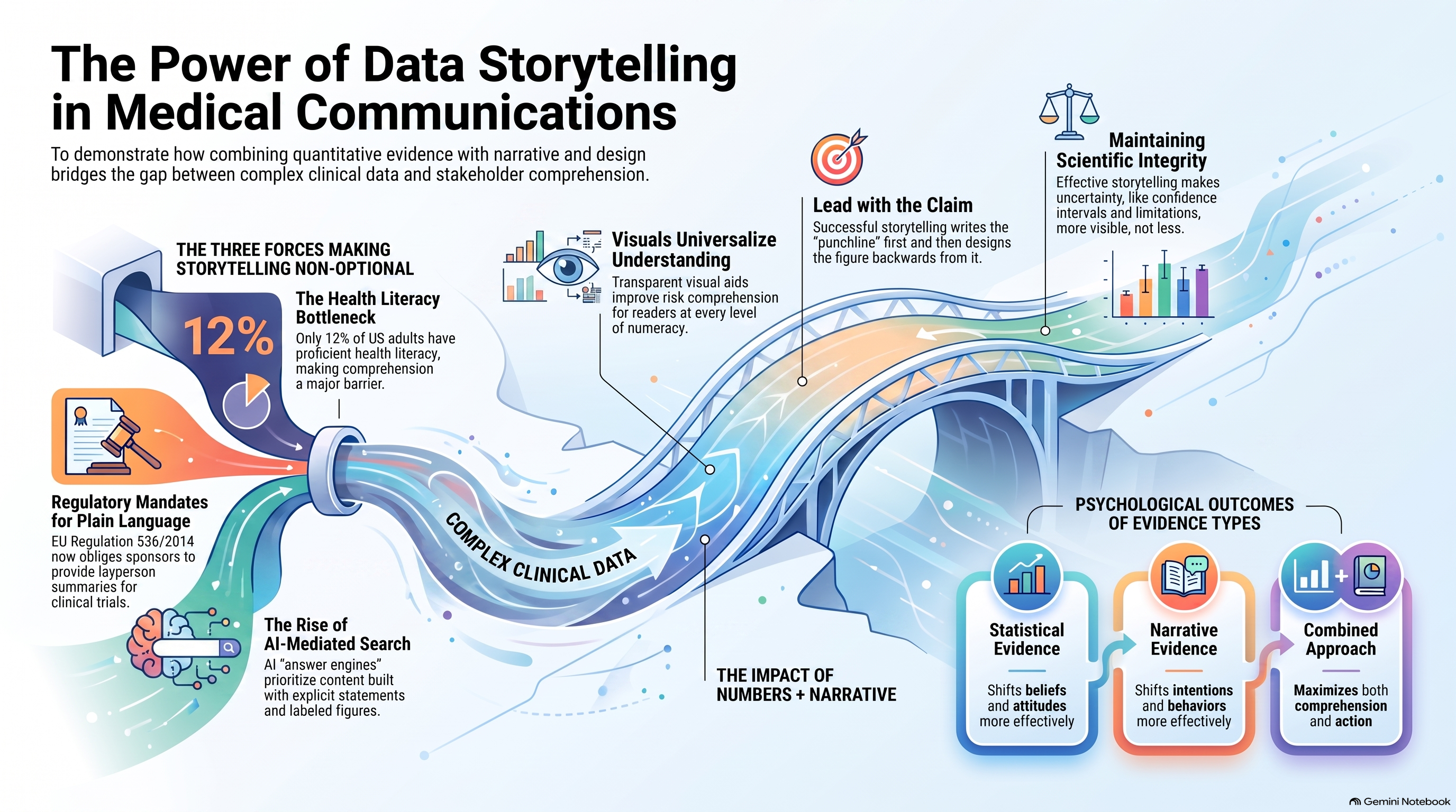
Key Summary: Clinical evidence no longer travels on its own. Between AI-mediated search, persistently low health numeracy, and regulations that write plain language into law, the distance between having good data and being understood has widened. Data storytelling, pairing accurate numbers with narrative structure and deliberate visual design, is the skill that closes it.
What Is Data Storytelling in Medical Communications?
Data storytelling is the practice of combining quantitative evidence, narrative structure, and visual design. It helps an audience understand what a dataset shows, why it matters, and what to do next. In medical communications, it spans a forest plot in a publication extender, a Kaplan–Meier curve in a congress deck, and an icon array in a lay summary.
It is not decoration. It is also not simplification at the expense of accuracy. It is the discipline of making the signal legible without distorting it.
3 Forces that Made This Skill Non-Optional
- Comprehension became the bottleneck.
The National Assessment of Adult Literacy found that only 12 percent of US adults had proficient health literacy, with more than a third scoring at basic or below [1]. Publishing data is now easy; however, the challenge lies in ensuring understanding, which effective medical communication can bridge.
- Plain language is a regulatory requirement.
Annex V of EU Regulation 536/2014 obliges sponsors to file a layperson summary of trial results alongside the technical summary [2]. EFPIA’s guiding principles recommend pitching that summary at roughly a sixth- to eighth-grade reading level [3]. Anyone writing to that brief is doing data storytelling, whether or not they call it that.
- Your audience increasingly meets your data through a machine.
The 2026 Edelman Trust Barometer found that 35 percent of people now consult an AI platform with health questions [4]. Among clinicians, daily generative-AI use tripled year on year, from 10 to 38 percent of physicians [5]. Answer engines extract claims; content built around explicit statements, labeled figures, and clean structure gets retrieved and cited. Content that buries its finding in paragraph nine does not receive the same level of attention.
Numbers and Narrative are NOT Rivals
Two findings should shape how you work
First, well-designed visuals genuinely improve understanding. A systematic review covering 36 studies and 27,885 participants across 60 countries concluded that transparent visual aids improve risk comprehension for readers at every level of numeracy and graph literacy [6]. This is a stronger evidence base than most communication interventions claim.
Second, the story-versus-statistics debate is a false one. A meta-analysis of 50 studies and 13,113 participants found no overall difference in persuasiveness between narrative and statistical evidence. The statistical evidence shifted beliefs and attitudes more effectively, while narrative shifted intentions [7]. Match the format to the outcome you need, and use both when you need them.
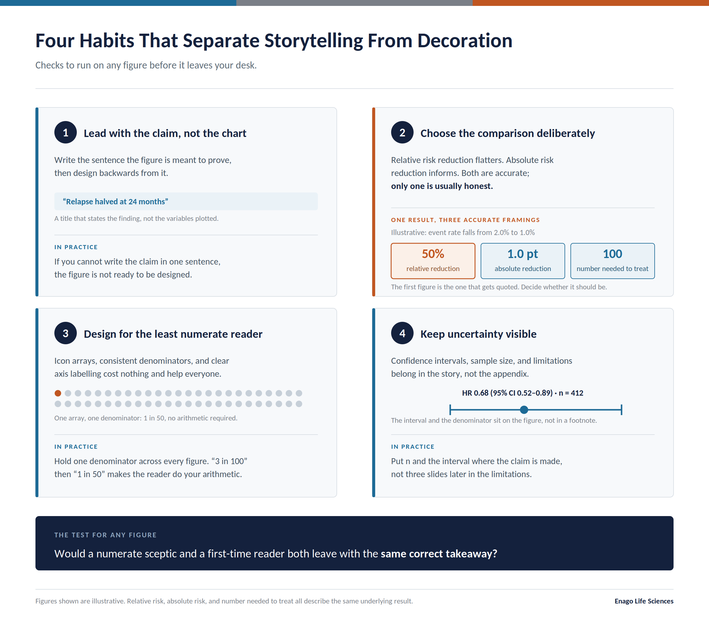
- Lead with the claim, not the chart. Write the sentence the figure is meant to prove, then design backwards from it.
- Choose the comparison deliberately. Relative risk reduction flatters; absolute risk reduction informs. Both are accurate. Only one is usually honest.
- Design for the least numerate reader in the room. Icon arrays, consistent denominators, and clear axis labelling cost nothing and help everyone.
- Keep uncertainty visible. Confidence intervals, sample size, and limitations belong in the story, not the appendix.
Where This Shows up in Practice
Every deliverable in a modern publication plan is now a data storytelling artefact: plain language summaries, publication extenders, infographics, congress posters, MSL slide decks. Teams that treat medical communications as a writing task alone tend to produce accurate content nobody finishes reading.
The stronger model pairs scientific writers with designers from the outset. Dedicated medical graphic design support exists for precisely this reason — turning dense datasets into visuals that survive scrutiny rather than merely illustrating them.
The same logic applies to training. Medical education programmes built around visual learning, rather than text volume, hold attention longer and transfer more of it.
Frequently Asked Questions
Q. Is data storytelling the same as data visualisation?
A. No. Visualisation is one component. Storytelling adds sequence, context, and an explicit takeaway.
Q. Does data storytelling compromise scientific accuracy?
A. Only when done badly. Sound practice makes uncertainty more visible, not less
Q. Who needs this skill?
A. Medical writers, publication planners, medical affairs teams, MSLs, and patient engagement leads, anyone whose output includes a number.
References
- Kutner, Mark, Elizabeth Greenberg, Ying Jin, and Christine Paulsen. The Health Literacy of America’s Adults: Results from the 2003 National Assessment of Adult Literacy. NCES 2006-483. Washington, DC: National Center for Education Statistics, U.S. Department of Education, 2006. https://nces.ed.gov/pubs2006/2006483.pdf.
- European Parliament and Council of the European Union. “Regulation (EU) No 536/2014 of 16 April 2014 on Clinical Trials on Medicinal Products for Human Use, and Repealing Directive 2001/20/EC,” Annex V. Official Journal of the European Union L 158 (May 27, 2014). https://eur-lex.europa.eu/eli/reg/2014/536/oj/eng.
- European Federation of Pharmaceutical Industries and Associations. Reflection Paper: EFPIA Guiding Principles on Layperson Summary. Brussels: EFPIA. https://www.efpia.eu/media/25661/reflection-paper-efpia-guiding-principles-on-layperson-summary.pdf.
- “The Chatbot Will See You Now: A Crisis in Trust?” June 16, 2026. Citing the 2026 Edelman Trust Barometer. https://www.medscape.com/viewarticle/chatbot-will-see-you-now-crisis-trust-2026a1000k73.
- Fierce Healthcare. “Wolters Kluwer Health Survey Examines AI Use and Concerns Among Clinicians, Patients in 2026.” June 3, 2026. https://www.fiercehealthcare.com/ai-and-machine-learning/wolts-kluwer-health-survey-examines-ai-use-concerns-among-clinicians.
- Garcia-Retamero, Rocio, and Edward T. Cokely. “Designing Visual Aids That Promote Risk Literacy: A Systematic Review of Health Research and Evidence-Based Design Heuristics.” Human Factors 59, no. 4 (2017): 582–627. https://doi.org/10.1177/0018720817690634.
- Xu, Jie. “A Meta-Analysis Comparing the Effectiveness of Narrative vs. Statistical Evidence: Health vs. Non-Health Contexts.” Health Communication 38, no. 14 (2023): 3113–24. https://doi.org/10.1080/10410236.2022.2137750.
Author:

Rebecca D’souza, PhD.
Associate Content Expert, Enago Academy
Connect with Rebecca on LinkedIn