
Visualizing Physiological Systems: 6 Effective Strategies for Communicating Complex Medical Concepts Through Illustrations

Communicating complex medical concepts to patients, colleagues, and the general public often poses a considerable challenge. From charts and graphs to 3D visualizations and artificial intelligence, the way we convey medical information is undergoing a transformational shift. One powerful solution is the integration of visuals to simplify and enhance comprehension.
Visual aids such as diagrams, illustrations, charts, and interactive media can simplify and clarify difficult health concepts. When designed effectively, visuals can efficiently convey meaning, emphasize key points, demonstrate relationships and processes, and engage audiences. They have the ability to transcend language barriers, bridge knowledge gaps, and make complex information more accessible. In this article, we explore key strategies for effectively communicating complex medical concepts through visuals.
10 Factors to Keep in Mind When Creating Visuals for Communicating Medical Concepts
|
Factor |
Description |
| Understand Your Audience | Tailor visual complexity and style to the target audience’s health literacy level and informational needs |
| Simplify Complex Information | Break down concepts into digestible pieces conveyed through flowcharts, diagrams, infographics |
| Use Clear and Consistent Imagery | Maintain consistency in color, symbols, fonts to establish visual hierarchy and transmission of information without clutter |
| Utilize Interactive Visuals | Enable exploration of concepts through animations and virtual reality at the audience’s own pace to boost engagement |
| Employ Metaphors and Analogies | Bridge understanding gaps by relating complex ideas to familiar objects, processes or scenarios |
| Tell a Visual Story | Logically sequence information to guide the audience through a narrative that enhances retention |
| Feedback and Iteration | Seek regular input from the target audience and refine materials accordingly to maximize effectiveness |
| Accessibility Considerations | Provide alternative formats for diverse cognitive/visual abilities and learning styles |
| Collaborate with Design Experts | Work with medical illustrators, graphic designers to optimize visual appeal, accuracy and communication |
| Incorporate Technology | Leverage innovations like virtual reality for immersive, interactive concept exploration |
6 Strategies for Communicating Medical Concepts Using Visual Illustrations
1. Embrace Visual Simplicity
Medical terminology and physiological systems can be highly intricate. Visually communicating health information in a clear, coherent way requires simplifying complex concepts through symbolic representation. Effective medical visuals utilize straightforward design elements that efficiently direct viewer attention and minimize cognitive workload.
Research shows visuals with higher graphic complexity, such as those with excessive detail or distracting decorative components, are less intelligible for viewers. Streamlined, straightforward visual presentation supports rapid comprehension.
Strategies for promoting visual clarity include:
- Focusing graphics on a single key idea or relationship
- Eliminating non-essential imagery and text
- Using clean, distraction-free backgrounds
- Organizing layouts logically
- Employing universal healthcare symbols and iconography
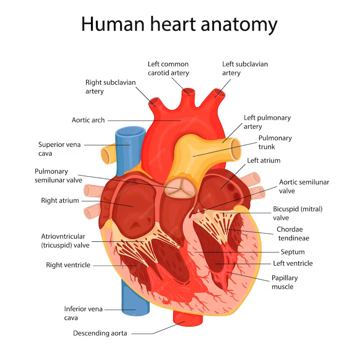
For example: A simple 2D cross-section diagram of the human heart, without decorative background images or textures, using basic shapes and colors to depict essential anatomical structures.
![]() 2. Implement Color Strategically
2. Implement Color Strategically
When used judiciously, color is a powerful tool for distinguishing different structures or chemical constituents, highlighting significant findings, and providing projective depth cues through shading. However, in excess, color can overwhelm viewers and obscure meaning.
Effective application of color in medical visuals should:
- Establish logical color coding systems
- Use sufficiently muted, pastel, or desaturated tones
- Ensure adequate color contrast between elements
- Avoid color combinations that trigger visual fatigue or distortions
Additionally, since a sizable percentage of viewers have various forms of color blindness, accessible visuals should utilize redundant cueing such as textural or stylistic indicators rather than color alone to convey meaning.
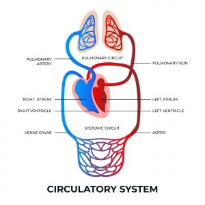
For example: A diagram of blood flow using muted red and blue arterial and venous blood vessels clearly distinguished through desaturated but adequately contrasting tones.
3. Spotlight Vital Material
Medical graphics should deliberately emphasize the most clinically valid or actionable information through visual prominence. Users filter and process visuals selectively, focusing initial attention on large, bold, centralized imagery. Leveraging techniques like size contrast, text weight variation, arrows, and strategic placement of modal words/figures directs viewer consideration towards key ideas and relationships while reducing cognitive drainage.
However, stark graphical hierarchies should balance attracting viewer consideration towards priorities against de-emphasizing peripheral concepts to the point that additional context is lost. Some nuanced medical information still provides valuable framing and qualifications that sustain comprehension.
For example: An illustration of the digestive system emphasizing the esophagus, stomach and intestines larger in size and specific in color.

4. Structure Logical Presentation
For multifaceted topics like human anatomy or disease pathways, logically structuring visual layout builds viewer comprehension by clarifying connections between medical concepts. Diagrams with unorganized or disjointed layout are difficult to understand because the relationships between elements are not clear.
Visually grouping related functional or structural elements, showing causal chains through arrows, and providing orienting structural scaffolds such as segmentation outlines or container shapes promote the rapid formation of accurate mental models from depicted medical information. Using consistent stylistic conventions, positioning conventions, and flow directionality also aid viewer cognition.
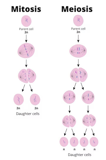
For example: A step-wise diagram using a left-to-right flow directionality and segmented containers to delineate the sequential phases of mitosis and meiosis in logical order.
5. Incorporate Interactivity
While static visuals effectively convey core medical concepts and relationships, interactive media enables customization, exploration of detailed content, and active information seeking directed by viewer interests. The capacity to expand, reconfigure, or filter graphics through input methods like hovering, toggling, scrolling, clicking, sliding, or querying supercharges communicative potential.
Interaction design strategies that strengthen medical visual communication include:
- Supporting viewer control over content breadth/depth
- Animating dynamic processes in a stepwise, measurable fashion
- Allowing customized viewing angles on three-dimensional forms
- Providing explanatory pop-ups and rollovers of symbols
- Linking supplementary media like video explanations of convoluted mechanisms
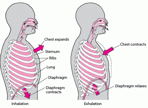
For example: A digital respiration model dynamically animates the process of inhaling and exhaling with pop-up definitions.
6. Balance Accuracy and Lucidity
Translating quantitative data and multifaceted physiological phenomena into cogent diagrams or illustrations involves considerable reduction and aesthetic interpretation. Graphical abstractions, by definition, discard or obscure some real-world intricacy to enable visual traction.
However, stripping away excessive detail should not engender outright misrepresentation of medical science. Maintaining fidelity to empirical evidence and anatomical reality, even in simplified schemas, sustains accuracy essential for clinical utility.
For example: Simplified infographic representation about disease risk conveying core trends in accessible charts while also linking to more detailed statistical data for transparency.
Final Thoughts
Effectively designed medical visuals are invaluable for clarifying elaborately detailed and highly technical health information into comprehensible graphic representations. Maintaining reasonable fidelity to empirical evidence remains vital amid necessary graphical abstraction. With sound design strategies and informational balance, intricate subject matter like human disease and anatomy can become broadly accessible.
However, in the era of data and technology-driven healthcare, entrusting medical design to professionals for data processing, visualization, and presentation ensures that medical content withstands the evolving market pressures. This marks a significant stride towards effective communication in the evolving landscape of healthcare.
As technology continues to advance, the integration of visuals will play an increasingly pivotal role in shaping the future of medical communication.
Author:

Uttkarsha Bhosale
Editor, Enago Academy
Medical Writer, Enago Life Sciences
Connect with Uttkarsha on LinkedIn